Buttons
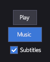
A Button runs an action when the player clicks or taps it, or activates it with the keyboard or a gamepad. A ToggleButton and a CheckBox also keep an on/off state: use a toggle button for a mode the player switches (music on or off), and a check box for an option in a list of settings.
Markup
<!-- Button runs a command; ToggleButton and CheckBox keep an on/off state in IsChecked. -->
<StackPanel Orientation="Vertical">
  <Button Margin="0,0,0,8" Command="{Binding PlayCommand}">Play</Button>
  <ToggleButton Margin="0,0,0,8" IsChecked="True">Music</ToggleButton>
  <CheckBox IsChecked="True">Subtitles</CheckBox>
</StackPanel>
Text inside a button becomes its content: a string is shown in a TextBlock. Any element can be
the content instead, for example an icon and a label in a StackPanel.
Key properties
| Property | Description |
|---|---|
| Command | The command the button runs. Bind it to your view model's command. |
| Content | What the button shows: text or any element. |
| IsChecked | Whether a toggle button or check box is on. |
| CheckBrush | The color of a check box's check mark. |
Events and commands
A button raises Click and runs its Command when activated. A toggle button and a check box flip IsChecked and raise IsCheckedChanged.
Styling
In the default theme, buttons are dark grey with light text, and they size to their content and sit centered in the
space they're given. Set HorizontalAlignment="Stretch" (or VerticalAlignment) on a button to make it fill its slot,
for example in a menu column.
The theme's styles use these visual state groups. A group of your own with the same name replaces the theme's (see Control templates and visual states):
| Control | CommonStates |
FocusStates |
CheckStates |
|---|---|---|---|
Button |
Hovered, Pressed |
Focused |
|
ToggleButton |
Hovered, Pressed |
Focused |
Checked |
CheckBox |
Hovered |
Focused |
Checked |
See Resources and styles in the markup reference.
Keyboard, gamepad and touch
A focused button runs its command on Enter or the gamepad's A button; a toggle button or check box flips its state. Arrow keys and the D-pad move focus between controls. A tap runs the command, like a click.
ToggleButton
Looks like a button and stays highlighted while it's on (the Checked state).
CheckBox
A box with a check mark next to its content. Use it in settings lists; use a toggle button for a mode on a toolbar or HUD.