Lists and selection
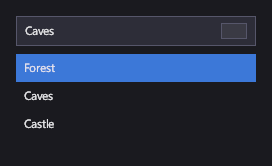
These controls show a collection of items from your view model. A ListBox shows them all and lets the player select one; a ComboBox and a Dropdown show the selected item and open a list on demand. An ItemsControl just shows items, and a WrapGrid lays them out in a grid of equal cells, like an inventory.
Markup
<!-- ComboBox and ListBox show the items of ItemsSource and select one of them. -->
<StackPanel Orientation="Vertical" Width="240">
  <ComboBox ItemsSource="{Binding Levels}" SelectedIndex="1" Margin="0,0,0,8" />
  <ListBox ItemsSource="{Binding Levels}" SelectedIndex="0" Height="96" />
</StackPanel>
ItemsSource comes from the data context (here, a list of level names). SelectedIndex can be set before the items
arrive: it's applied as soon as they do.
Key properties
| Property | Description |
|---|---|
| ItemsSource | The items to show. Use an ObservableCollection<T> to have additions and removals appear. |
| ItemTemplate | How each item looks. Without one, an item shows its ToString(). |
| SelectedIndex / SelectedItem | The selection; -1 / null for none. |
| DisplayMemberPath | For a combo box or dropdown, the item property to show. |
| IsOpen | Whether a combo box's or dropdown's list is open. |
| ItemWidth / ItemHeight | A wrap grid's cell size. |
Events and commands
SelectionChanged fires when the selection changes. Binding
SelectedItem two-way is usually simpler.
Styling
Each item sits in a SelectorItem with the visual states Hovered, Selected, SelectedHovered, Highlighted,
HighlightedHovered and Disabled. A combo box and a dropdown use Hovered and Focused.
Items are virtualized: only the ones in view get a container, and containers are reused as the list scrolls, so an item template mustn't keep state of its own that doesn't come from its item.
Keyboard, gamepad and touch
A click or tap selects an item. On a focused combo box or dropdown, Enter or the gamepad's A button opens the list, the arrow keys and the D-pad move the highlight, and Enter or A commits it. Escape or B closes the list. A combo box also filters its list as the player types.
Note
A list box's items can't be selected with the keyboard or a gamepad yet; only by clicking or tapping.
ListBox
Shows its items in a column. Inside a ScrollViewer, it scrolls; on its own, it shows the items that fit its height.
ComboBox
An editable box: the player can type to filter the list.
Dropdown
Like a combo box, without the text entry.
ItemsControl
The base of all these: items and a template, no selection.
WrapGrid
Fills rows of equal cells and wraps, for inventories and level grids.
See also
- Scrolling for long lists.
- Data binding in the markup reference.