Range controls
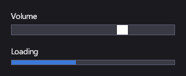
A Slider lets the player pick a value in a range by dragging its thumb: volume, sensitivity, field of view. A ProgressBar shows a value in a range: loading, health, experience.
Markup
<!-- Slider picks a value in a range; ProgressBar shows one. -->
<StackPanel Orientation="Vertical" Width="240">
  <TextBlock Margin="0,0,0,4">Volume</TextBlock>
  <Slider Minimum="0" Maximum="100" Value="70" Margin="0,0,0,16" />
  <TextBlock Margin="0,0,0,4">Loading</TextBlock>
  <ProgressBar Minimum="0" Maximum="100" Value="40" Height="8" />
</StackPanel>
Bind Value to your view model to read or drive it: Value="{Binding Volume, Mode=TwoWay}".
Key properties
| Property | Description |
|---|---|
| Minimum / Maximum | The range. |
| Value | The current value, kept inside the range. |
| ThumbBrush | The thumb's color. |
| Value | The progress, between Minimum and Maximum. |
| FillBrush | The filled part's color. |
Events and commands
ValueChanged fires while the player drags.
Styling
The slider's template has a part named PART_Thumb, and its visual states are Hovered (a lighter thumb) and
Focused. The progress bar's template has a part named PART_Fill, sized to the value.
Keyboard, gamepad and touch
The slider follows the mouse or a finger while dragged. It takes focus, so the arrow keys and the D-pad can reach it.
Note
The arrow keys and the D-pad don't change a slider's value yet; they move focus past it.
Slider
Values outside the range are clamped to it.
ProgressBar
Display only: it doesn't take focus or input.
See also
- Lists and selection for choosing from a set of values instead.