Color and property editors
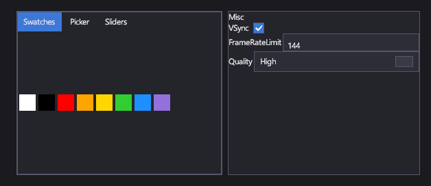
A ColorPicker lets the player choose a color: from swatches, on a hue and saturation picker, or with sliders and a hex code. A ColorPickerButton is a compact button that shows the color and opens a picker in a popup. A PropertyGrid edits the public properties of any object, which suits debug panels and level editors.
Markup
<!-- ColorPicker edits a color; PropertyGrid edits an object's public properties. -->
<StackPanel Orientation="Horizontal">
  <ColorPicker SelectedColor="#FF3C78D8" Width="300" Height="240" Margin="0,0,16,0" />
  <PropertyGrid Target="{Binding Settings}" Width="280" />
</StackPanel>
The property grid's Target is an object with VSync (bool), FrameRateLimit (int) and Quality (an enum)
properties.
Key properties
| Property | Description |
|---|---|
| SelectedColor | The chosen color. |
| SwatchColors | The palette on the Swatches tab. It starts with eight common colors; call RefreshSwatches() after changing it. |
| SelectedColor | The button's color, shared with its popup picker. |
| Target | The object whose properties the grid edits. |
Events and commands
ColorChanged fires when the color changes. The property grid writes each edit to the target's property directly.
Styling
The theme's styles set the backgrounds and borders of all three; their parts are built in code and have no named template parts.
Keyboard, gamepad and touch
The picker's tabs, swatches and sliders respond to clicks and taps. The property grid's editors are ordinary text boxes, check boxes, combo boxes and sliders, so they work as described on those controls' pages.
ColorPicker
Size it explicitly (for example 300 × 240): its tabs need room.
ColorPickerButton
Shows a swatch of its color; a click opens the picker below it, or above it when there's no room.
PropertyGrid
Picks an editor from each property's type:
string: a text box;bool: a check box;- numbers: a text box, or a slider with a text box when the property has a
[Range]attribute; - enums: a combo box of the enum's values;
Color: a color picker button.
Properties are grouped under their [Category], or "Misc" without one. Read-only properties show their value but
can't be edited.
See also
- Text and Range controls, the editors the property grid uses.