Tabs and navigation
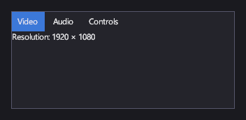
A TabControl shows one page at a time under a row of tabs, for example the sections of a settings screen. A Frame shows one Page at a time and navigates between pages, with back and forward history, for whole screens of a menu.
Markup
<!-- TabControl shows the TabItems in ItemsSource as tabs, and the selected tab's Content below them. -->
<TabControl ItemsSource="{Binding Tabs}" SelectedIndex="0" Width="320" Height="140" />
The tabs come from ItemsSource: a list of TabItems, each with a header and the page it shows.
Here the view model provides them:
// The view model behind <TabControl ItemsSource="{Binding Tabs}" />: each TabItem is a tab's header and its page.
public static IReadOnlyList<TabItem> CreateSettingsTabs() =>
[
    new TabItem { Header = "Video", Content = "Resolution: 1920 × 1080" },
    new TabItem { Header = "Audio", Content = "Master volume: 70%" },
    new TabItem { Header = "Controls", Content = "Invert Y axis: off" },
];
Key properties
| Property | Description |
|---|---|
| ItemsSource | The TabItems. |
| SelectedIndex | The open tab. |
| Header / Icon | A tab's label and icon. |
| Content | A tab's page (on the TabItem). |
| Navigation | A frame's navigation: the current page and its history. |
Events and commands
SelectionChanged fires when the open tab changes.
Styling
Tab headers are SelectorItems, styled like list items (Hovered, Selected, ...). The tab control's own style sets
its background and border.
Keyboard, gamepad and touch
A click or tap on a tab opens it.
Note
Tabs can't be switched with the keyboard or a gamepad yet.
TabControl
Keeps only the open tab's page in the layout.
Frame and Page
A frame navigates between pages described in markup; see Pages and navigation in the markup reference.
See also
- Lists and selection: a tab control is a list of tabs with a selection.